Where would you both like to see improvements in?
The more detailed you both could be, the better 🧡
Thread
Login to reply
Replies (2)
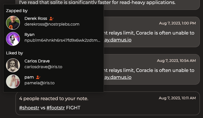
I find the whole UI kind of unattractive. The dark mode colors aren't quite dark enough and make it look kind of muddy. Lots of small details just feel a little off to me. Like the radius on the corners of these notification elements. And how they say 'x' interacted with your note. Interacted how?


Details definitely need love, luckily I've got some designers planning to help me out. If you click on the "x people" you'll get a pop-up with some details:

