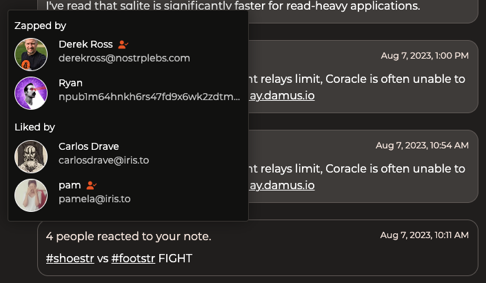
I find the whole UI kind of unattractive. The dark mode colors aren't quite dark enough and make it look kind of muddy. Lots of small details just feel a little off to me. Like the radius on the corners of these notification elements. And how they say 'x' interacted with your note. Interacted how?