Professional apps need professional logo's.
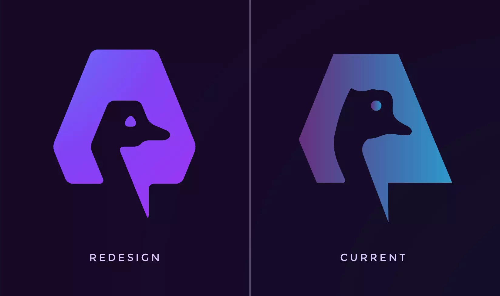
Current Amethyst logo:
- has the wrong colors
- the eye is not part of the compound path
- lacks alignment
- the A is hard to recognize
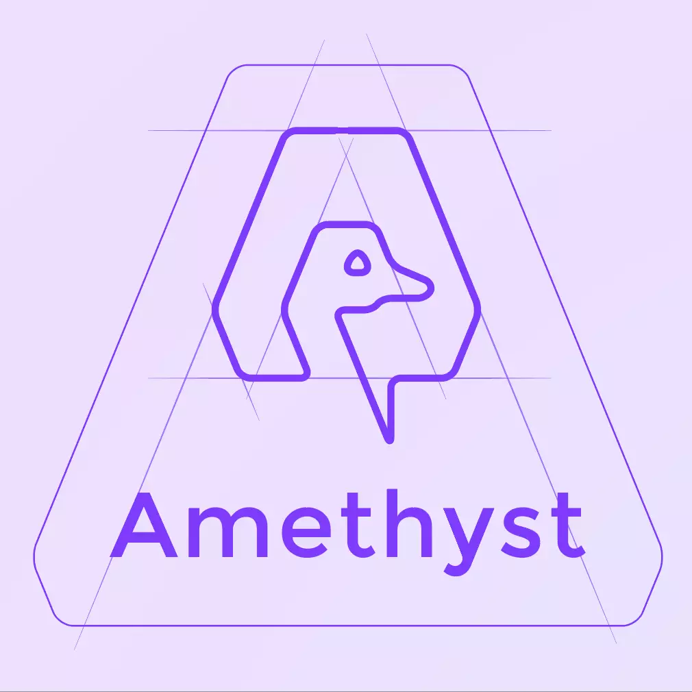
Redesign I did a while back:
https://w3.do/T29KyB0w
No pressure though @Vitor Pamplona 😉
#nostrdesign #logo