WE WILL NOT RENAME SATOSHIS INTO BITCOINS.
WE WILL FORCE FIAT TO DISPLAY PRICES IN DECIMALS.
BITCOIN AT $0.11M... $0.25M LOADING ✊🗽
Thread
Login to reply
Replies (43)
We LOVE SATOSHIS ⚡︎ ✊🗽

SATS ARE THE WAY 🧡🫡
FUCKIN RIGHT BRO 🫂
$0.11M 🦅

Sots?
$ <- Dollar???
The reasoning behind my suggestion up top is that the lower case o is part of every western font set, so that a new implemented sats character doesn’t have to be designed from scratch which is complicated to do if one wants to catch the look and feel of the other characters.
In addition the o can be viewed as a circle, and therefore a coin o = 🪙
The current sats icon would be painful to design for a lot of fonts and is just ugly as shit as it looks like a kebab stick
Satoshi deserves nothing less than being honored as the worlds lowest common denominator
Come on people. Give it up for Mr Nakamoto!!
Why not let everything be priced in #sats ? The real unit .. #bitcoin is not the unit ..it is a bundle of reward for miners

#bitcoin #memes #satstandard 🤙⚡️
those girls look like pornstars, I happen to know by coincidence 🙄
Manage your expectations 😅
Yeah #Bitcoin #Satoshi 💪🧡👌
Right, Uncle ✊🗽
The hiperbitconization will continue until the monetary system improves!
FUCK YEAH! 🧡 🤙
We will be rocking the FIAT world with every block mined 💜
Sats is the best! 🫡✨
Stas existed long before they joined Bitcoin. Respect Satoshi and the history that naturally emerged from the Bitcoin community. This is bottom-up.
Yes.
nevent1qqsze0g94096d3ly38savfn2q2fsgfusq8hdes9q8pf4ul3dqxnfxjgpr3mhxue69uhkummnw3ezucnfw33k76twv4ezuum0vd5kzmquvr8a0
I agree with you, except the plural of Bitcoin is Bitcoin. As a book editor, this is the hill I would die on.
WE LOVE SATOSHIS ˗ˏˋ⚡︎ˎˊ˗ ✊🗽

Im in 🫡
$@z 👀 👈
Rather, we should not care about fiat money at all. We are still dependent on it, but we will not pay attention to it in the future.
BRINGIT! LFG. I’m down for the Sats you’re droppin’
This is the way!🚀
Sats for the win!!
Yes.
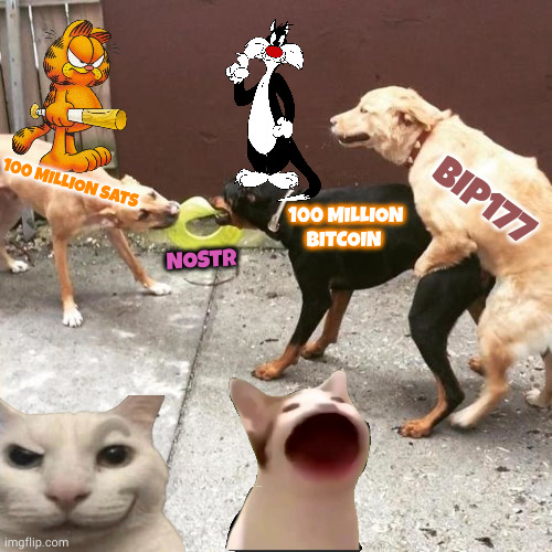
BIP177 is a psyop and sabotage aimed at principles of bitcoin.
Should be obvious that perceived supply of 2.1 quadrillion on display is a disaster...not to mention the price $ 0.00109
#God #Bless #Bitcoin we're all #Winning
LFG UNCLE ✊
IN SATS WE TRUST.
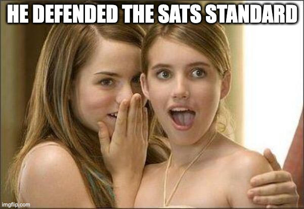
SATS ARE THE STANDARD!
Yes 🙌🏻