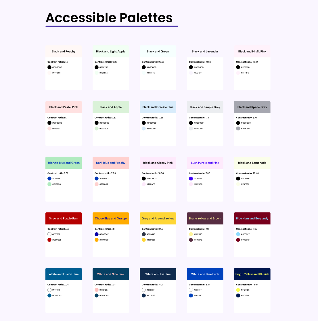
Color accessibility might sound scary when you start. There are 3 things to be careful about:
- Don’t use color as the only visual means of conveying an information, action, etc. (WCAG 1.4.1)
- Ensure sufficient contrast ratio between text and their background. (WCAG 1.4.3): 4.5:1 for text (strictly) smaller than 24px, or 19px bold and 3:1 for text larger or equal to 24px, or 19px bold
Color accessibility: tools and resources to help you design inclusive products by Stéphanie Walter - UX Researcher & Designer.