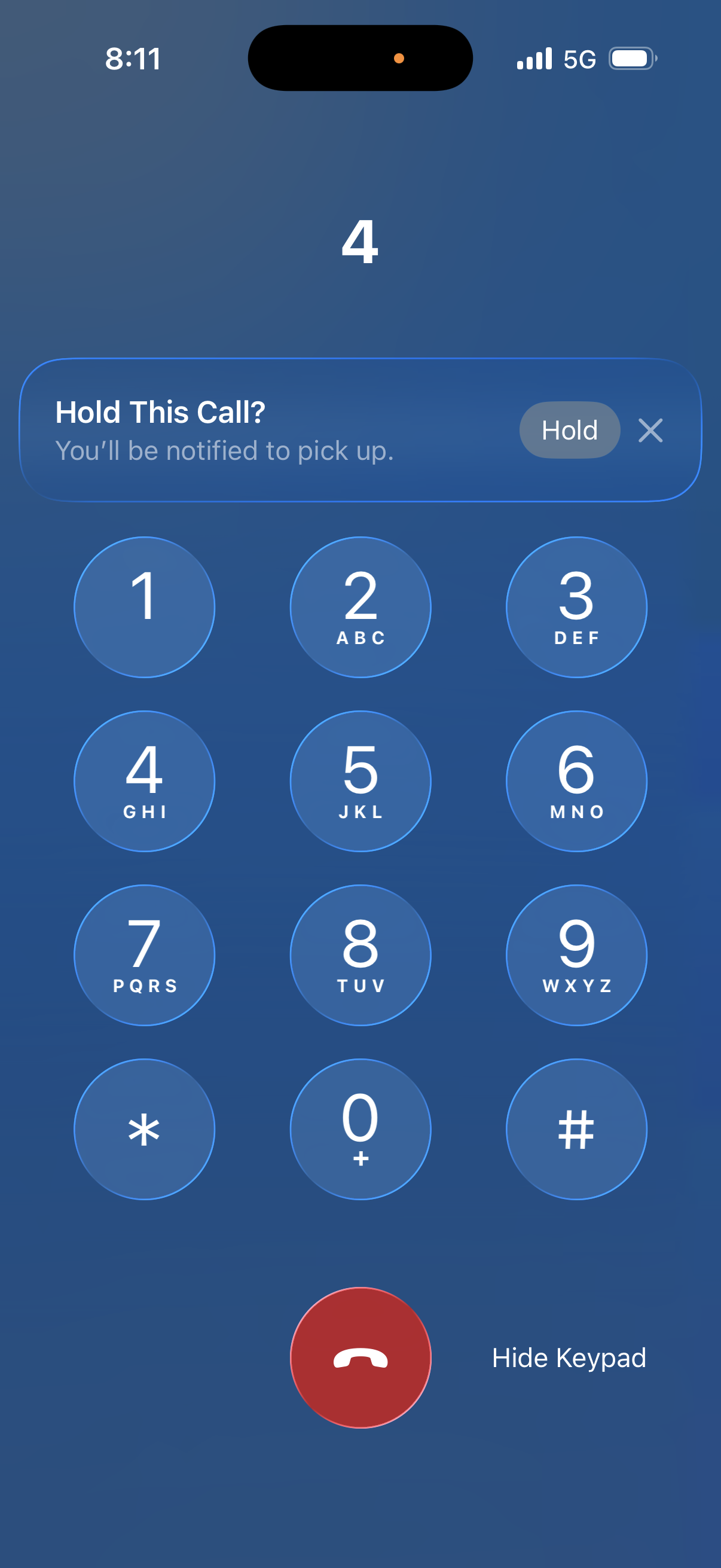
I don't want to seem like I'm nitpicking too much, but the "Hold This Call?” UI needs another pass.
The small "Hold” button is nearly touching the needlessly tiny dismiss (✕) button, which only seems about 24pt wide.
This will be error-prone for lots of people in practice. Opposite actions should not be represented by tiny, immediately neighboring touch targets.
I know it's a small thing, but it's the kind of thing that has me worried that institutional UI talent is drained or marginalized.
