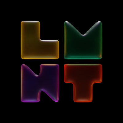
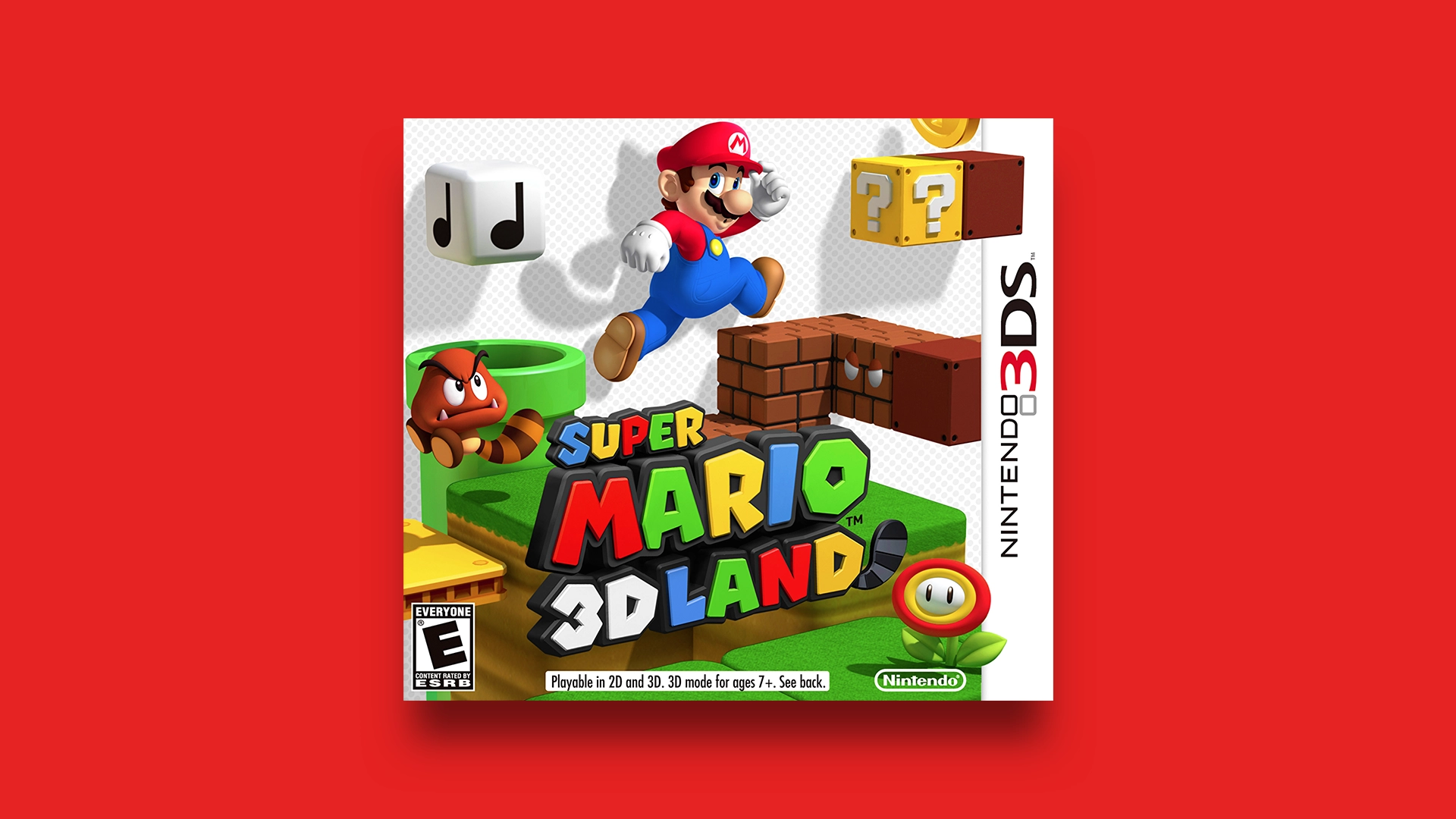
✍️ This may be the silliest post I’ve ever written.
But I had to figure out what the “most Mario” colors were. Follow me on this bizarre journey of useless discovery.
🔗
As we get increasingly more tired with social media companies who keep inventing problems, I’m still wondering why more people don’t have websites and RSS feeds. It’s the way out.
🔗
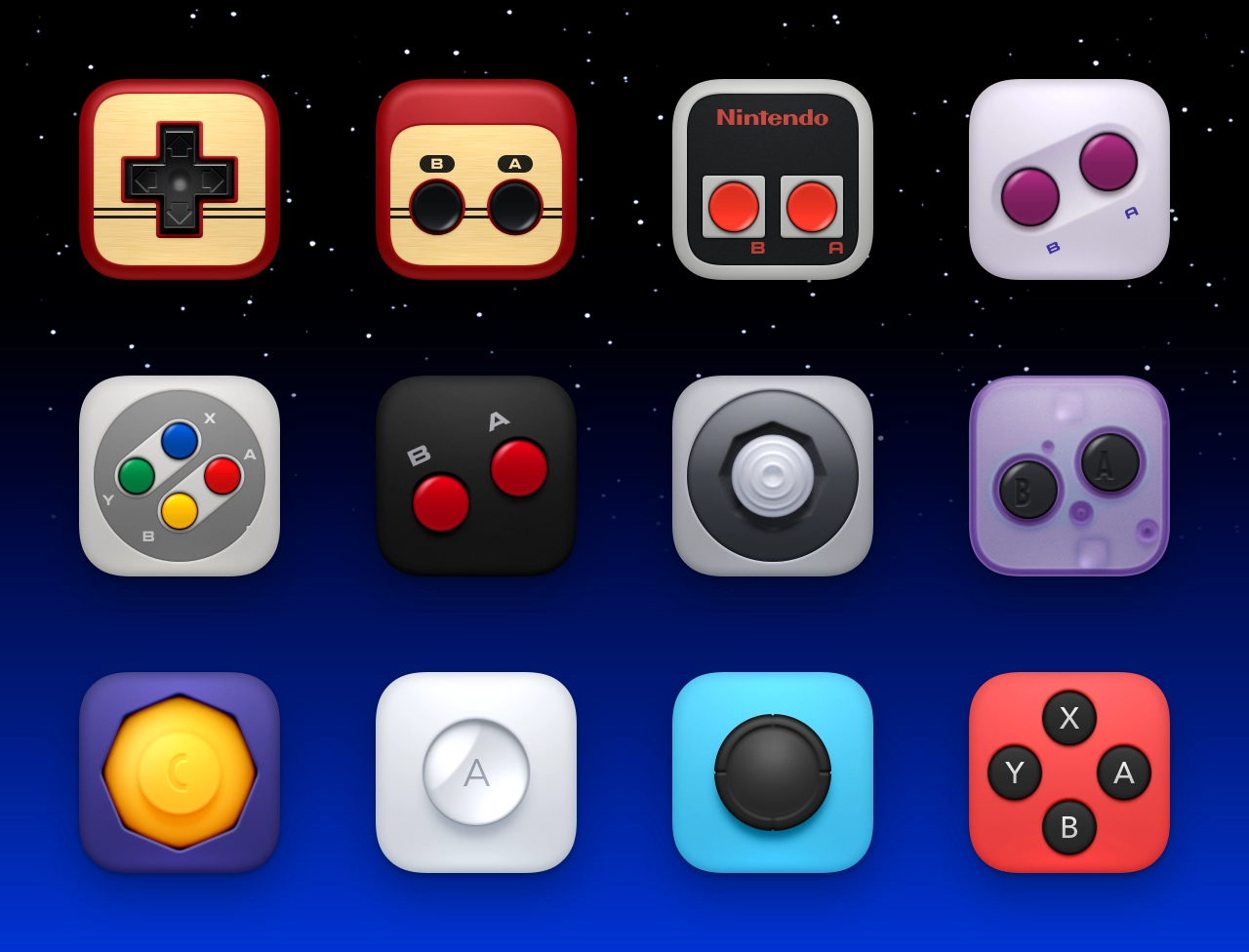
🎮 Right about now feels like a great time for fun and games. So here they are— Nintendo Controllers, a set of 20 icons that depict various button arrays from different systems over the years.
🔗
💻 Finders Keepers, Vol. 2
An expansion pack of 12 Finder icons, including Ceramic, Gold, Silver, and Sapphire Glass. Kabuki? Picasso? *Phantom of the Operating System*? Yep.
💸 These icons are free, but please donate if you enjoy them! ♡
🔗
This is a long shot but is there any chance that anyone downloaded (and still has) these “Nintendo Revolution” / Wii icons of mine from around April 2007? It’s one of the only downloads I can’t seem to find anymore.
I reject the seriousification of companies and their products. I don’t want fast food joints to look upscale. I’m not saying they have to look trashy, but they should look fun and silly.
I don’t want things to be devoid of fun and whimsy, I want them to exhibit that. It has appeal! When everything is presented so seriously, it makes everything seem quite bland. How about some flavor! Some enthusiasm! Some style!