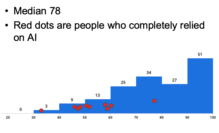
One of my colleagues made this histogram showing the results of the first test in their upper-division software engineering class. The blue bars are the whole class, the red dots are the students where the instructor is "confident that they completely used AI for the related assignment".
A note on correlation vs. causation: this graph alone doesn't indicate "AI use caused students to do poorly on the test" vs. "students who are unprepared at the beginning of the semester are more likely to use AI", or whether there is some other hidden factor connecting them.