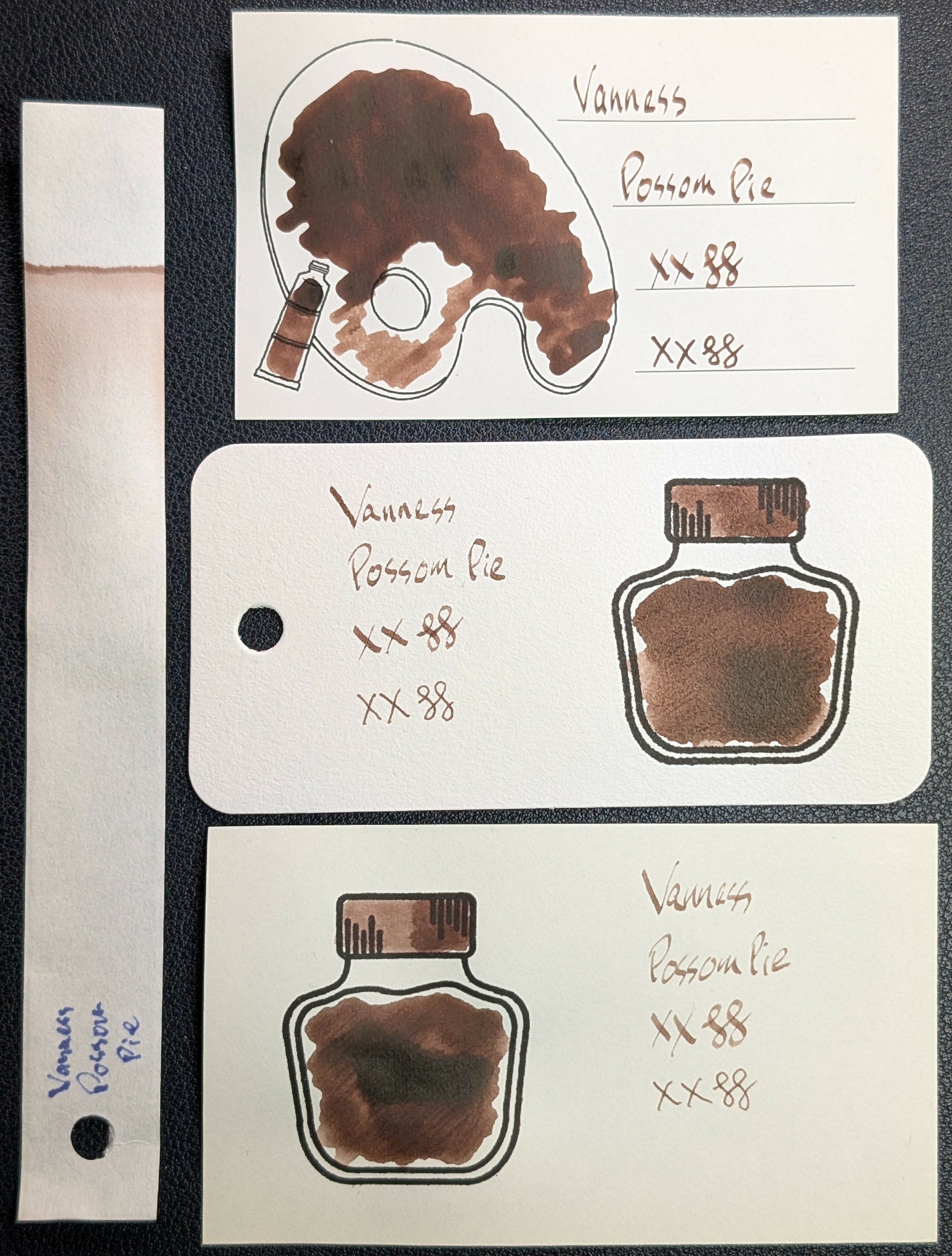
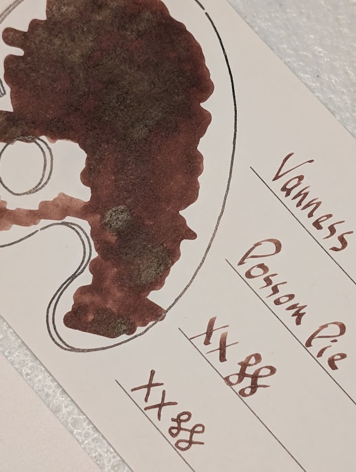
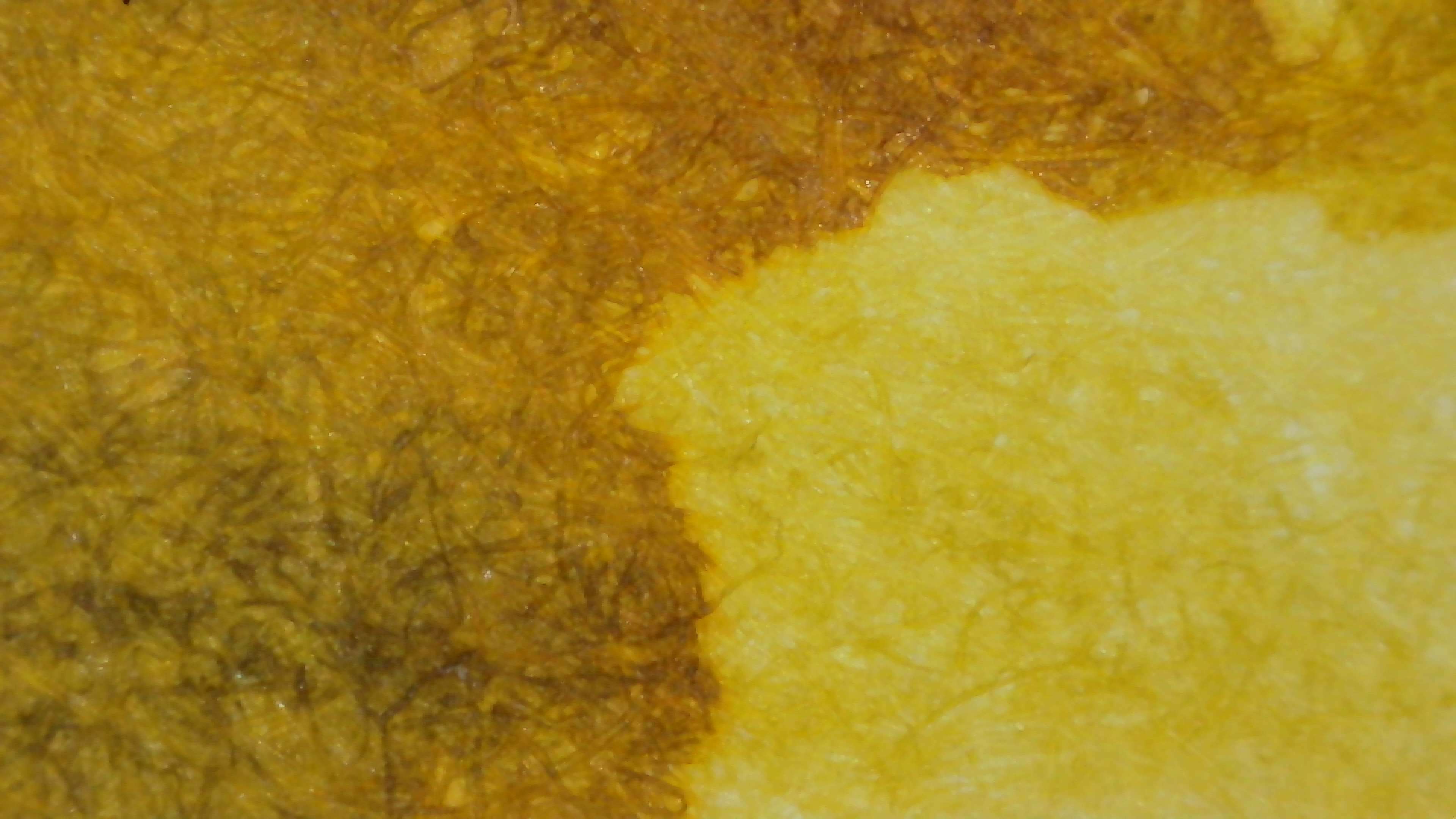
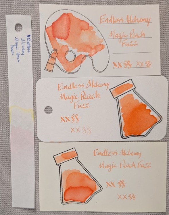
Here is a much better look at Vanness Possum Pie (Possom Pie, Opossum Pie, etc.), their LE Thanksgiving 2025 ink. It's not a bad shade of brown/sienna. The sheen in the large swatches doesn't show in the writing at all, which is good because it's not exactly pleasant. 
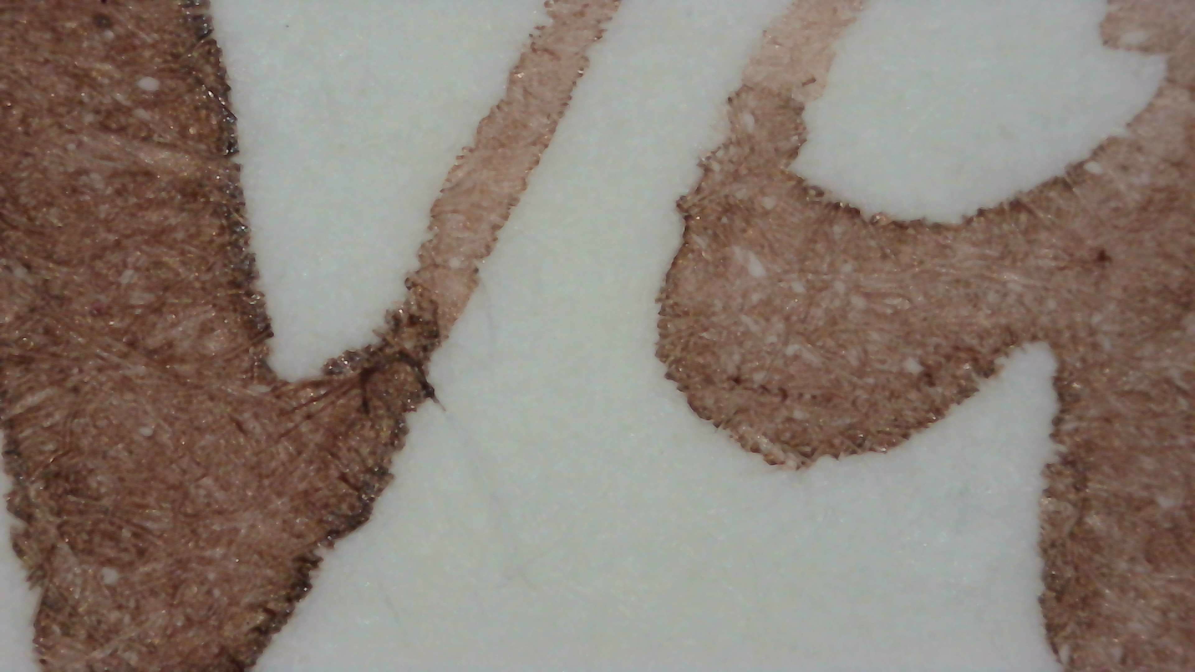
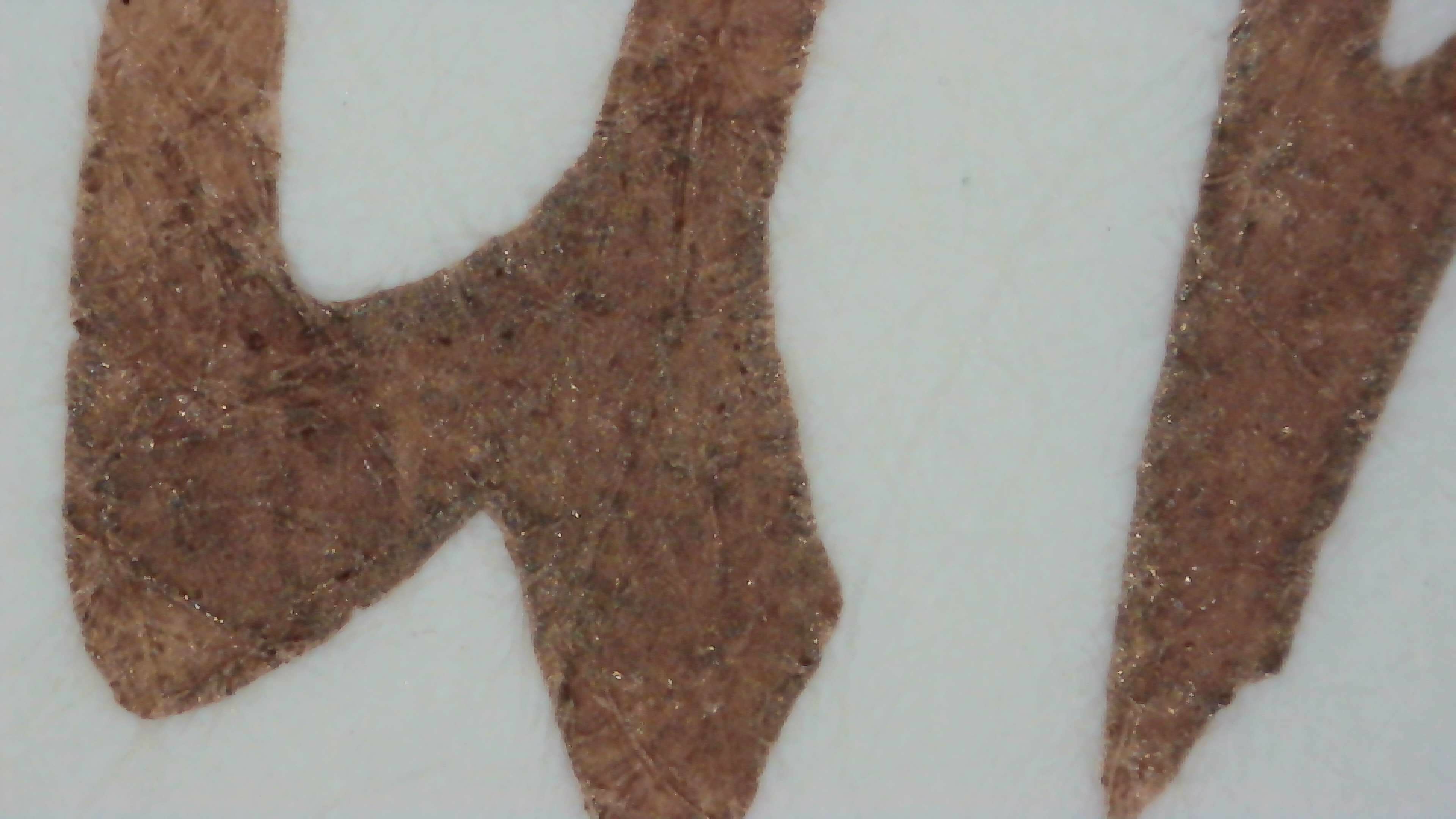
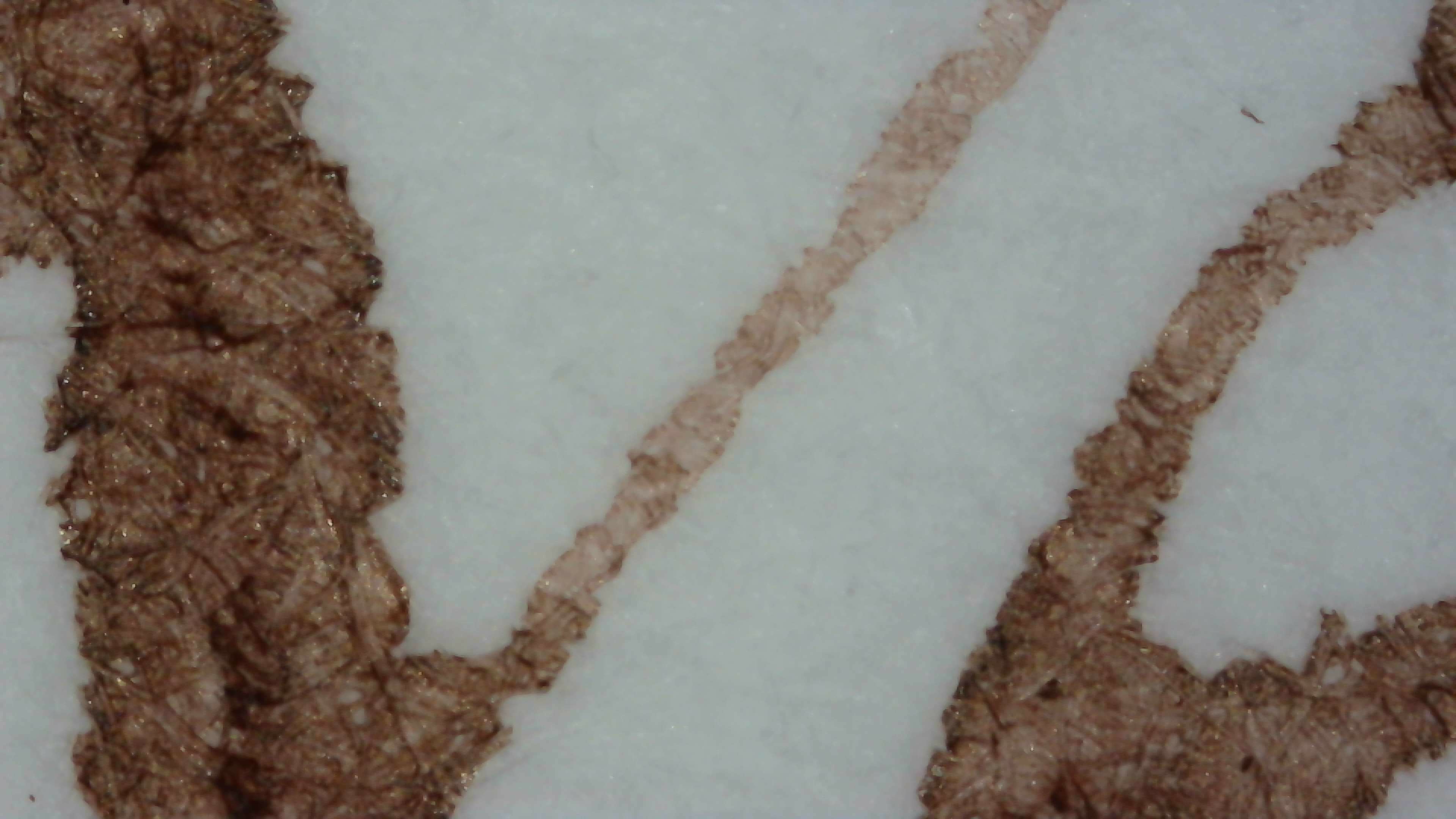
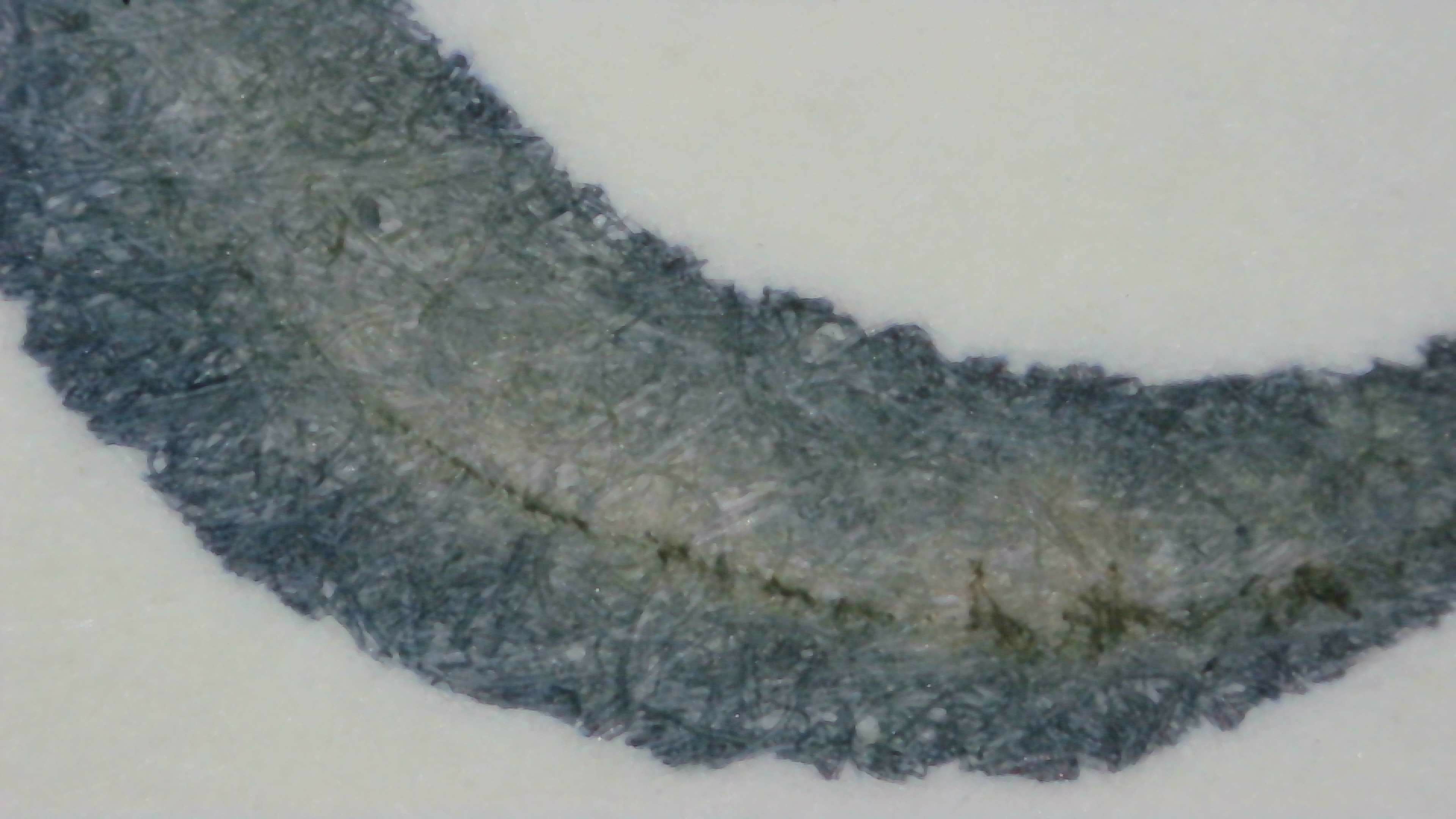
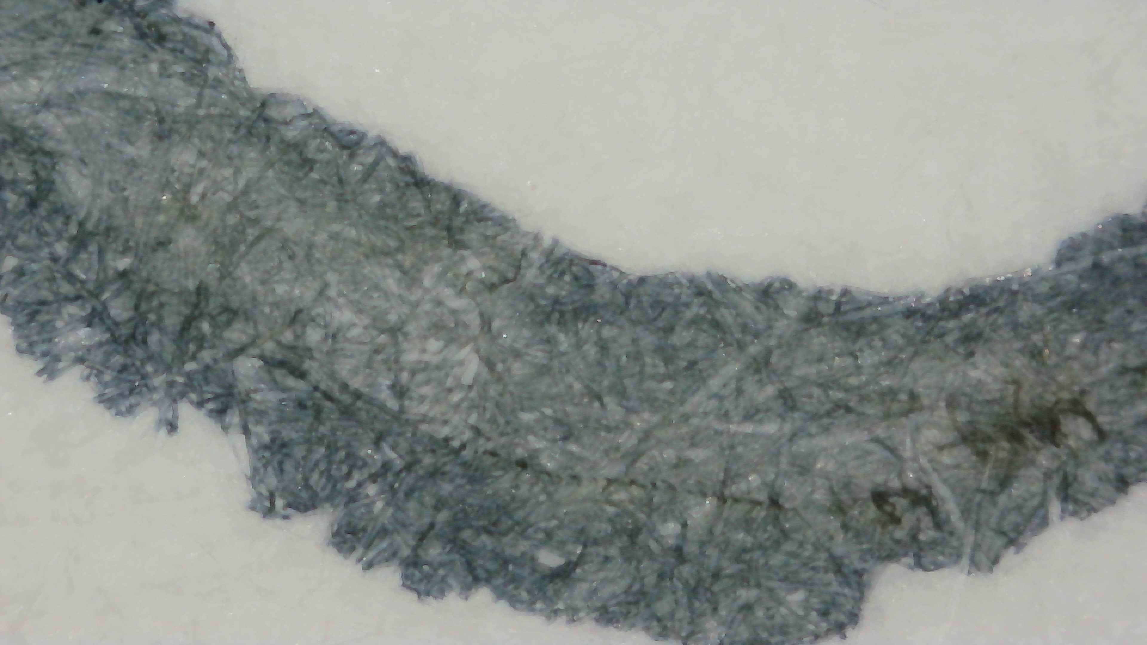
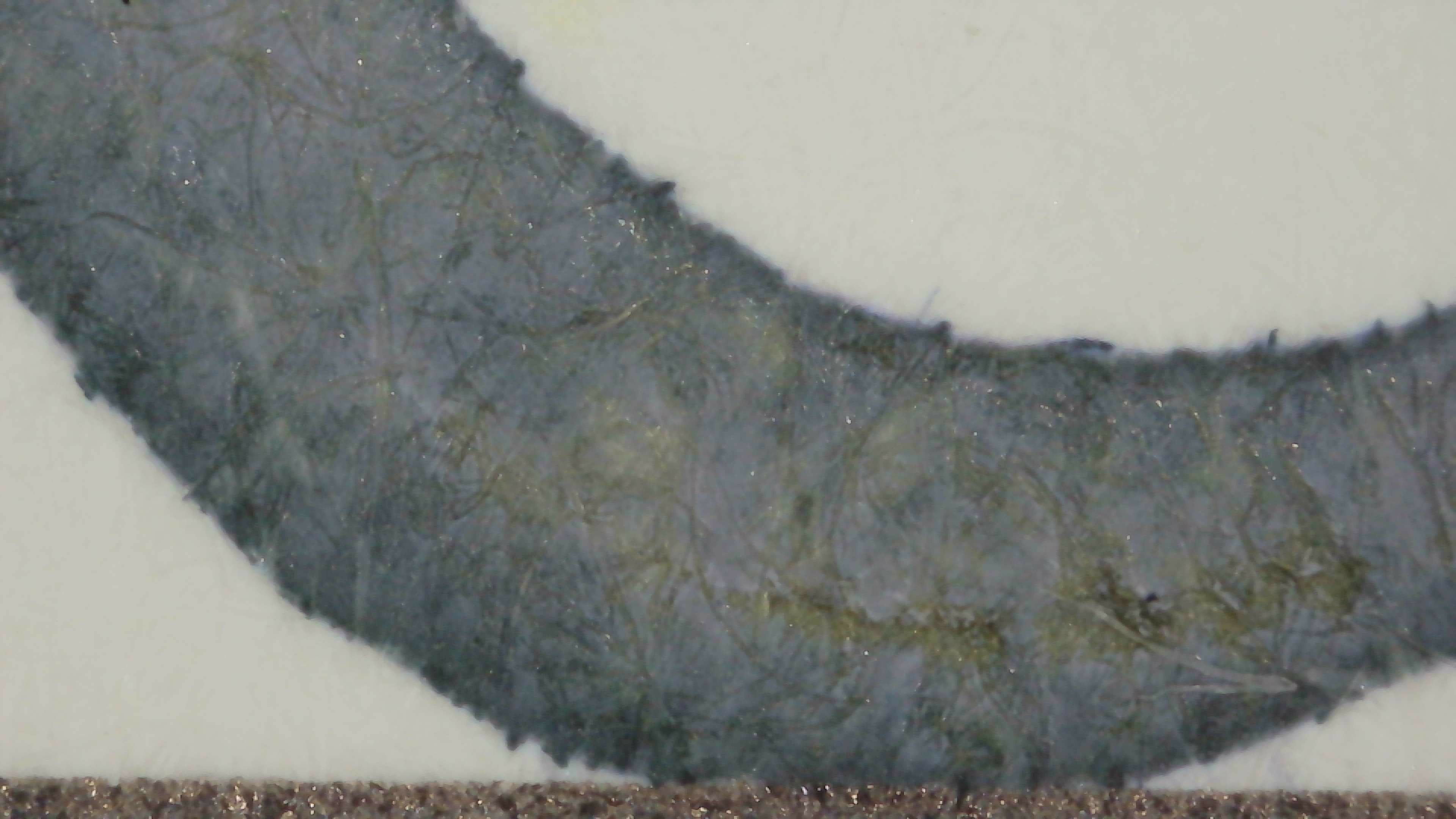
It is very dry! On Col-o-ring it was struggling to put down a line on the thin angle of the stub nib. Looks much nicer on Iroful. Midori was OK. (I'm also glad it is not scented!) #FountainPens #FountainPenInk
Still drying and no time for good photos, but he's a quick look at Vanness Possum Pie (aka Possom Pie/Opossum Pie, etc.), their limited edition Thanksgiving 2025 ink. It's dark brown with some shading and a hint of greenish sheen if you can make it put down a lot of ink. It's very dry, but still usable. Some of the thin strokes from the stub were extremely thin on col-o-ring, but more on that another day. #FountainPens #FountainPenInk image
My Vanness order from last week arrived with some things for Secret Santa and Vanness tossed in a sample of their LE Thanksgiving 2025 ink. Will be swatching that here shortly. ๐Ÿ‘€ #FountainPens
Looks like Platinum is raising prices on a bunch of pens again, quite a bit in some cases, though maybe just gold nib pens going up the most. I think I have all I want of those at the moment, so not likely I'll make any hasty "cost saving" panic buys before the end of the year. #FountainPens #FountainPen
Microscope photos of Colorverse Dust Storm. Doesn't look any better to me up close. I prefer more yellow-orange, and this is sort of a dark yellow-gray? Has some shading, but it's just lighter/darker and not any different colors mixed in. It's legible, though, and not too light. #FountainPens #FountainPenInk
Time for microscope photos/video of Colorverse - Life on Mars which is a "dusty" blue ink with chromashading. With this one I tried to get a similar shot of each paper (Midori, Col-o-ring, Iroful). Each one brings out the colors differently, though IMO, Midori does it best. The video in the fourth image moves around the large swatch area of the card and shows that there is even some red sheen that didn't show on other paper. #FountainPens #FountainPenInk
Some microscope photos of Endless Alchemy Peach Fuzz since I didn't include them before. Still not a fan of this one, but it makes another good example of the paper types and smoothness of the letters, shading, and such. Even when I forget to label or sort the photos between paper types it's not difficult to tell them apart from how the lines look. Iroful is extremely smooth, Midori is sorta smooth, and Col-o-ring is rough. Previous Post: #FountainPens #FountainPenInk