ParaNetics: Magnetic Motors for Airplane, Drones and Submersibles https://www.paranetics.com/copy-of-home ![](https://m.stacker.news/112432) # A Magnetic Field Orientation that Changes the Fundamental Design of Electric motors. ​ 
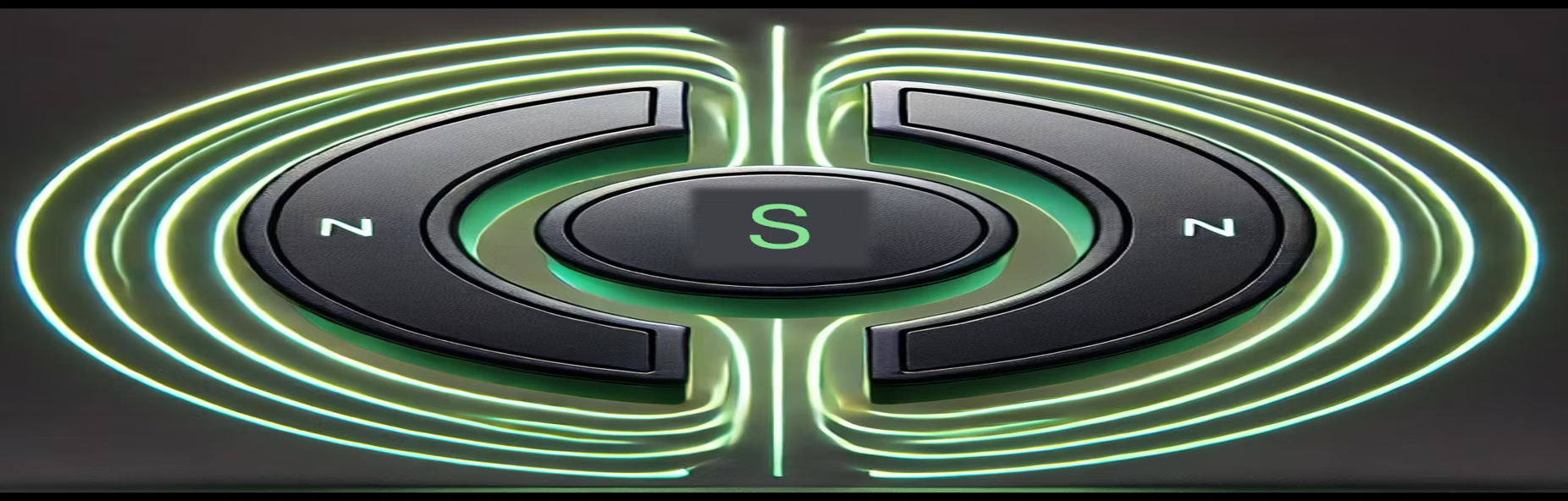
ParaNetic magnet produces magnetic field distinctly different from traditional permanent or electromagnets. Unlike conventional magnets, which have a single north and south pole, a ParaNetic magnet features a unique polarity configuration: it can generate two north poles with a south pole sandwiched between them, or two south poles with a north pole in between. This is described as a "virtual" or "projected" magnet, meaning it’s not a physical object in the traditional sense but rather a magnetic field effect created by a specific arrangement of electromagnets or permanent magnets..​ ![](https://m.stacker.news/112433) ​​​​​​​​​​​​​​​​​​​​​​​ 
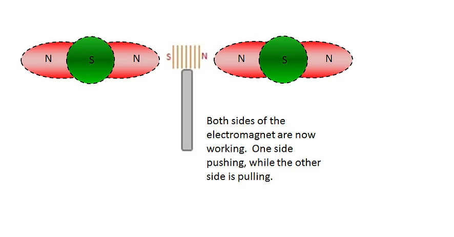
This unusual three-pole structure allows the ParaNetic magnet to interact with magnetic fields in ways standard magnets cannot. For example, objects can pass completely through its magnetic field, including the transition points where the poles switch, which isn’t possible with typical magnets where these boundaries are internal. This property, along with the ability to link multiple ParaNetic magnets in linear or circular layouts, forms the basis for advanced applications like the ParaNetic electric motor. ![](https://m.stacker.news/112434) ​​​​​​​​​​​​​​​​​​​​​​​​
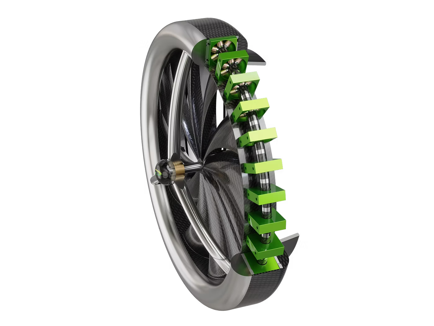
ParaNetic motors leverages both sides of the rotor and stator magnetic fields simultaneously, boosting efficiency, torque, and performance while reducing heat compared to conventional designs. The ParaNetic magnet’s design also enables unique functionalities, such as suspending permanent magnets at the polarity switch points with high precision, which has potential uses in valves, transducers, and even ion propulsion systems.​​​​​​​​​​​​​​
New experiment from @deSign_r: "Default Isn’t Design". Technology meets beauty. Mind-bending #design & #creativity:
"A Data Love Letter to the Subway" typed by @deSign_r. Starting conversations with brilliance always works. Tasteful #design & #creativity:
Default Isn’t Design https://eisenbergeffect.medium.com/default-isnt-design-24df33272abb ![](https://m.stacker.news/112252) Framework monoculture is a psychology problem as much as a tech problem. When one approach becomes “how things are done,” we unconsciously defend it even when standards would give us a healthier, more interoperable ecosystem. Psychologists call this reflex System Justification. Naming it helps us steer toward a standards-first future without turning the discussion into a framework war.
A Data Love Letter to the Subway A data-driven animation for Fulton Center commissioned by MTA Arts & Design for its 40th anniversary. ![](https://m.stacker.news/112244) # The animated installation visualizes each train line as a character whose unique qualities are extracted from MTA data. Commissioned by MTA Arts & Design for its 40th anniversary, Pentagram partner Giorgia Lupi has designed a data-driven animation for Fulton Center, with the synchronized artwork spanning all 52 screens across the FIDI transit hub. The animated installation, A Data Love Letter to the Subway, visualizes each train line as a character whose unique qualities are extracted from MTA data. Imaginatively unpacking and animating each line’s age, length, and path, Lupi writes a poetic story that explores the trains’ interwoven encounters with commuters and one another. By turning the overfamiliar into a dreamy narrative, Lupi’s Love Letter reveals the connections that hum in the background of our shared urban life. ![](https://m.stacker.news/112254) ![](https://m.stacker.news/112245) This commission was a chance to envision the subway system beyond a static informational map. Drawn to the beauty of the trains’ intersections, movements, and idiosyncrasies, Lupi and her team sought to unveil the visual poetry of this infrastructure: abstracting the trains’ data provides a rich view of their interactions, roles, differences, connections, and missed opportunities. Riding the subway is a collective experience, and a plurality of stories emerge when we rub shoulders with other commuting New Yorkers. Within these stories, the trains play an integral role — their doors close as we lock eyes with someone on the platform, or a skipped stop leads us to a conversation with a stranger. Lupi’s Love Letter prompts us to think about the subway as the backdrop and architect of these interactions. Transforming what is often a source of frustration and complaint for commuters, Lupi and her team reveal the poetry in the subway’s collective network of stories. ![](https://m.stacker.news/112246) ![](https://m.stacker.news/112253) Lupi and her team began the project by poring over subway records like MTA Open Data and missed connections boards. They extracted and arranged the data, asking how these numbers could be seen from different perspectives – but mainly they wrote a story, transforming their findings from the data repository into a narrative and script. The animation is intentionally black and white, with painterly features — both a nod to the whimsical and elemental nature of picture books and a site-specific effort to counter the visual noise at Fulton Center. The train’s lines are rendered with a hand-drawn quality, integrating the feeling of the initial sketches and maps. As we interact with each other and the world around us, we create data that often lingers in our subconscious. A Data Love Letter to the Subway reveals the subway ecosystem through the lens of this data, describing the hidden patterns in our everyday lives. Following the characteristics of different lines through the subway system, Lupi’s Love Letter celebrates the MTA’s data as a representation of the real world, and reminds us that data is an abstraction that can bring new perspectives to familiar structures and patterns. This data snapshot captures all New Yorkers — the trains are characters in our stories that take us places every day, relating us to the city and one another. A Data Love Letter to the Subway is on view at Fulton Center, New York, NY. The two minute animation will play at the top of every hour through January 5, 2026. ![](https://m.stacker.news/112249) ![](https://m.stacker.news/112250) ![](https://m.stacker.news/112251)
A Data Love Letter to the Subway A data-driven animation for Fulton Center commissioned by MTA Arts & Design for its 40th anniversary. ![](https://m.stacker.news/112244) # The animated installation visualizes each train line as a character whose unique qualities are extracted from MTA data. Commissioned by MTA Arts & Design for its 40th anniversary, Pentagram partner Giorgia Lupi has designed a data-driven animation for Fulton Center, with the synchronized artwork spanning all 52 screens across the FIDI transit hub. The animated installation, A Data Love Letter to the Subway, visualizes each train line as a character whose unique qualities are extracted from MTA data. Imaginatively unpacking and animating each line’s age, length, and path, Lupi writes a poetic story that explores the trains’ interwoven encounters with commuters and one another. By turning the overfamiliar into a dreamy narrative, Lupi’s Love Letter reveals the connections that hum in the background of our shared urban life. ![](https://m.stacker.news/112245) ![](https://m.stacker.news/112247) This commission was a chance to envision the subway system beyond a static informational map. Drawn to the beauty of the trains’ intersections, movements, and idiosyncrasies, Lupi and her team sought to unveil the visual poetry of this infrastructure: abstracting the trains’ data provides a rich view of their interactions, roles, differences, connections, and missed opportunities. Riding the subway is a collective experience, and a plurality of stories emerge when we rub shoulders with other commuting New Yorkers. Within these stories, the trains play an integral role — their doors close as we lock eyes with someone on the platform, or a skipped stop leads us to a conversation with a stranger. Lupi’s Love Letter prompts us to think about the subway as the backdrop and architect of these interactions. Transforming what is often a source of frustration and complaint for commuters, Lupi and her team reveal the poetry in the subway’s collective network of stories. ![](https://m.stacker.news/112246) ![](https://m.stacker.news/112248) Lupi and her team began the project by poring over subway records like MTA Open Data and missed connections boards. They extracted and arranged the data, asking how these numbers could be seen from different perspectives – but mainly they wrote a story, transforming their findings from the data repository into a narrative and script. The animation is intentionally black and white, with painterly features — both a nod to the whimsical and elemental nature of picture books and a site-specific effort to counter the visual noise at Fulton Center. The train’s lines are rendered with a hand-drawn quality, integrating the feeling of the initial sketches and maps. As we interact with each other and the world around us, we create data that often lingers in our subconscious. A Data Love Letter to the Subway reveals the subway ecosystem through the lens of this data, describing the hidden patterns in our everyday lives. Following the characteristics of different lines through the subway system, Lupi’s Love Letter celebrates the MTA’s data as a representation of the real world, and reminds us that data is an abstraction that can bring new perspectives to familiar structures and patterns. This data snapshot captures all New Yorkers — the trains are characters in our stories that take us places every day, relating us to the city and one another. A Data Love Letter to the Subway is on view at Fulton Center, New York, NY. The two minute animation will play at the top of every hour through January 5, 2026. ![](https://m.stacker.news/112249) ![](https://m.stacker.news/112250) ![](https://m.stacker.news/112251)
Craft, not fame, makes your story worth telling ![](https://m.stacker.news/112243) If you have a story to tell, the infrastructure is all there for you to write and publish it independently. All you need to do is decide your story is worth telling, write it from the heart, and then spend time crafting it. It’s not easy. It is pretty simple though.
image # What #creative #ideas have you been rambling on? This post is part of a series. It is meant to be a place for anyone to discuss a #WIP #projects, or an #idea worth to #build. Regardless of your #project being personal, professional, physical, digital, or even simply an #idea to brainstorm together. If you have any creative projects or ideas that you have been working on or want to eventually work on... This is a place for discussing those, gather initial feedback and feel more energetic on bringing it to the next level. ₿e #Creative, have #Fun, share it at #Design #innovate #innovation #creativity #createopportunities #Creator #create
@deSign_r unveils "A guide to creating accessible PDFs using free tools" - embracing inspiration. Marvel #design & #creativity:
New vision from @deSign_r: "Space Exploration Logo Archive". Building unforgettable #experiences, one #design at a time with #creativity.