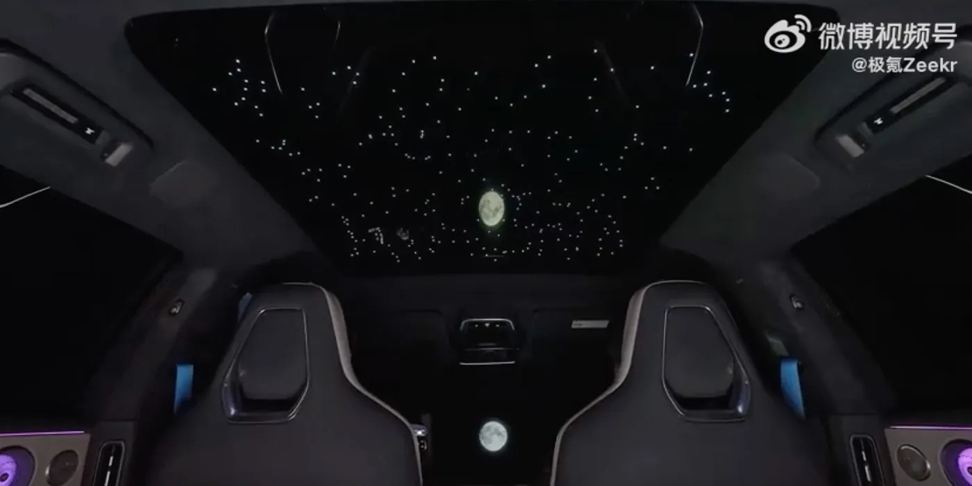
ZEEKR unveils new 001 design refresh with 900V architecture, 7-minute charging
 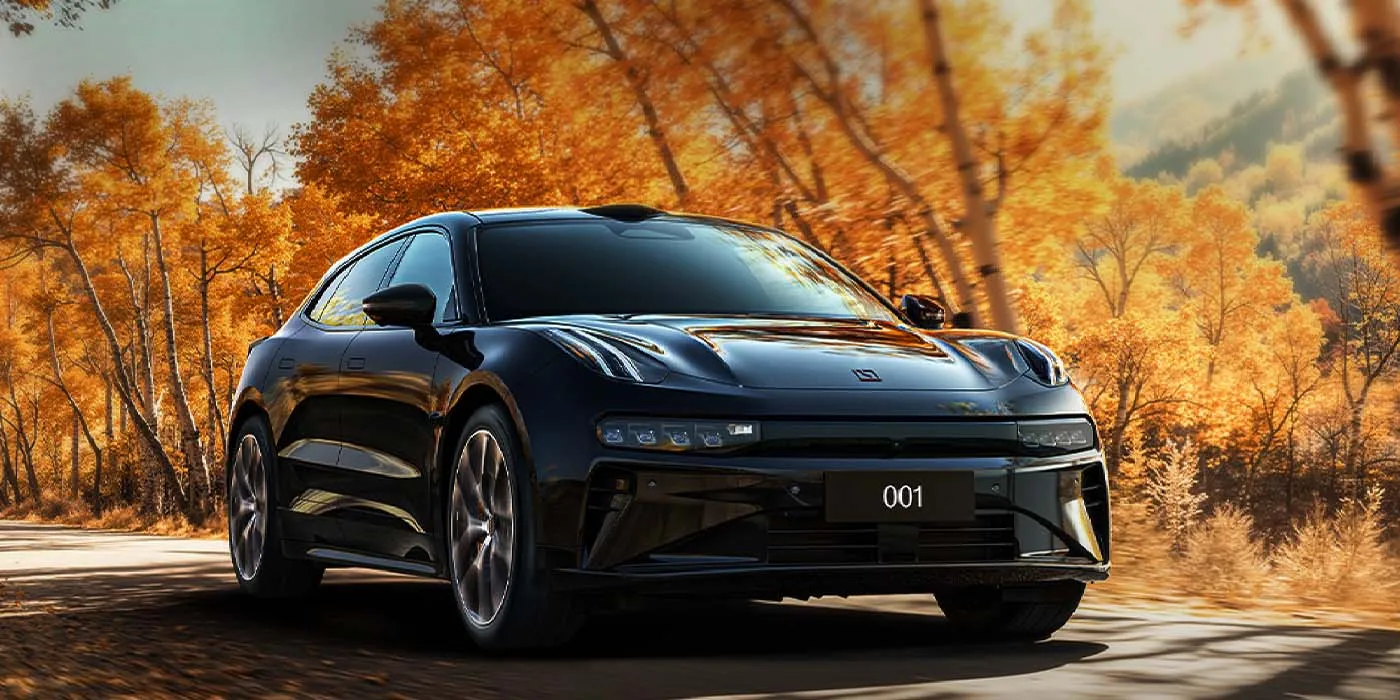
Chinese EV brand ZEEKR has announced a new design refresh to its flagship 001 EV model – the second in as many years. This latest upgrade to the 001 features ZEEKR’s 900V architecture, enabling better performance and some of the fastest charging speeds we’ve seen. The interior also appears quite cozy, allowing for a starry night setting on the panoramic roof.
If you know anything about the EV brand ZEEKR, you’ve probably heard of the 001 shooting brake EV. The flagship EV initially debuted in April 2021 and found early success in China before expanding its availability to new markets in Europe.
By 2023, the 001 has contributed to 64% of Zeekr’s annual global sales, including a high-performance quad motor variant called the 001 FR that was introduced in 2023. However, ZEEKR began selling a new model called the 007 in January 2024, which immediately overtook the 001 in popularity.
As a result, ZEEKR introduced a 001 refresh in February 2024, which offered customers new, lower-priced trims, plus improved performance. Even after the refresh, ZEEKR’s other models, like the 007 GT (which features newer tech at a lower price), continue to outsell the 001. So, ZEEKR has gone back to its design lab and introduced yet another 001 refresh for 2025, a much bigger overhaul.
 

Electrek
ZEEKR unveils new 001 design refresh with 900V architecture, 7-minute charging, and a 'starry' interior
Chinese EV brand ZEEKR has announced a new design refresh to its flagship 001 EV model – the second in as many years.
Stacker News
ZEEKR unveils new 001 design refresh with 900V architecture, 7-minute charging \ stacker news ~Design
Chinese EV brand ZEEKR has announced a new design refresh to its flagship 001 EV model – the second in as many years. This latest upgrade to the ...